Composition centre
Can you notice the difference between these two designs? They are showing the same information, the same content, but differently. And the right one is definitely the one that catches your attention more. It’s because the right one has a composition centre.
Please, don’t let the word centre confuse you. Being the composition centre does not mean being placed in the geometrical centre of the layout. (But does not exclude it being put in the centre as well). It is the dominant element that instantly draws the attention of the viewer.


If you want an element to be considered central, make it different from the others that surround it or from the background you put it on. A dominant element likely has greater visual weight than the elements it dominates.
This term is strongly related to visual hierarchy. It builds the structure and influences the order the eye perceives the information. The dominant element is on top of the hierarchy, leading the eye to the focal point, making the user read the text or see the information you want to emphasize. Should the viewer read one line of text, that will be your dominant. Because sometimes it will be the only line of text your user will read. Use this precious eye contact wisely.
How do you make an element the dominant of the composition? Long story short, make it different in visual weight. Make it stand out.
Use colour

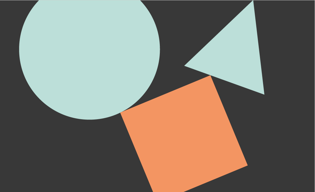


Choose the contrast colour on the colour wheel or make it significantly brighter or darker than all the other elements.
Use scale
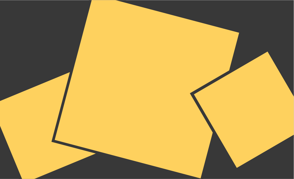


Changing the size allows you to show the difference between the elements and guide your reader/viewer. If you want your heading to stand out, make it significantly bigger than the other texts on the page. If you need one tiny detail to be noticed, make it smaller than the others and use negative space to outline this difference. Why not!
Make its shape, texture differrent


Solid filled form surrounded by the outlined ones even of the same shape will create this needed visual contrast.
Change brightness/saturation


Bright object sitting next to ones in muted colours will be easily noticed and attract attention of the viewer.
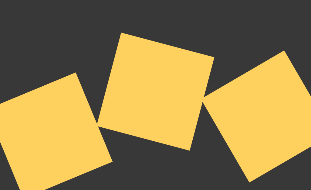
Change the direction or the natural flow


Changing direction also differs the element from its neighbours. Be brave and move it within the format.
Play with the axis directions and move your dominant from the centre, creating visual asymmetry.
Rotate and move the elements


Within myriads of similar elements the one using different angle or direction of flow will stand out.
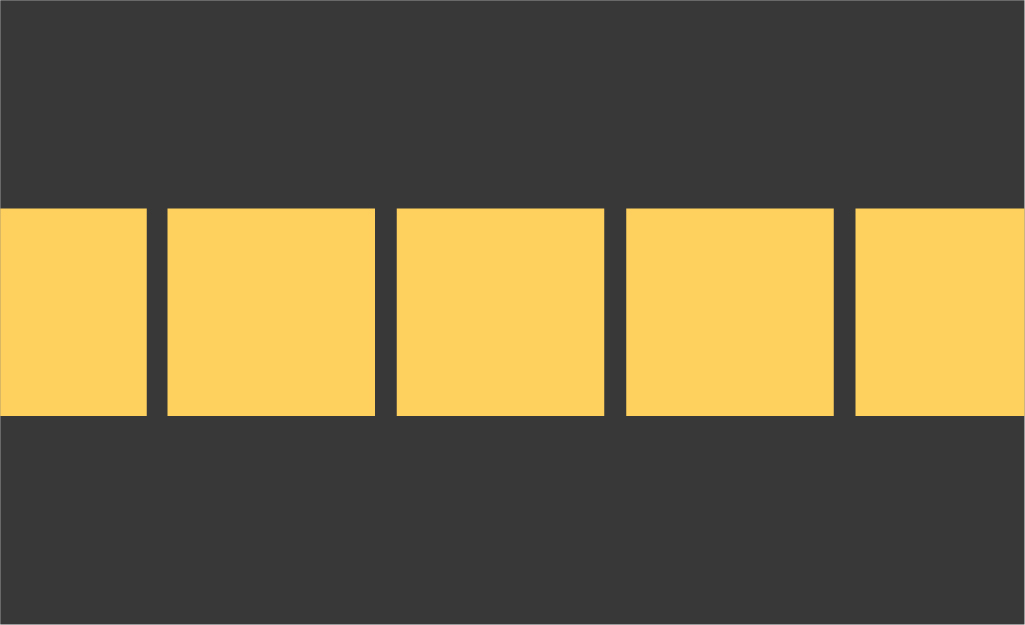
Use positioning

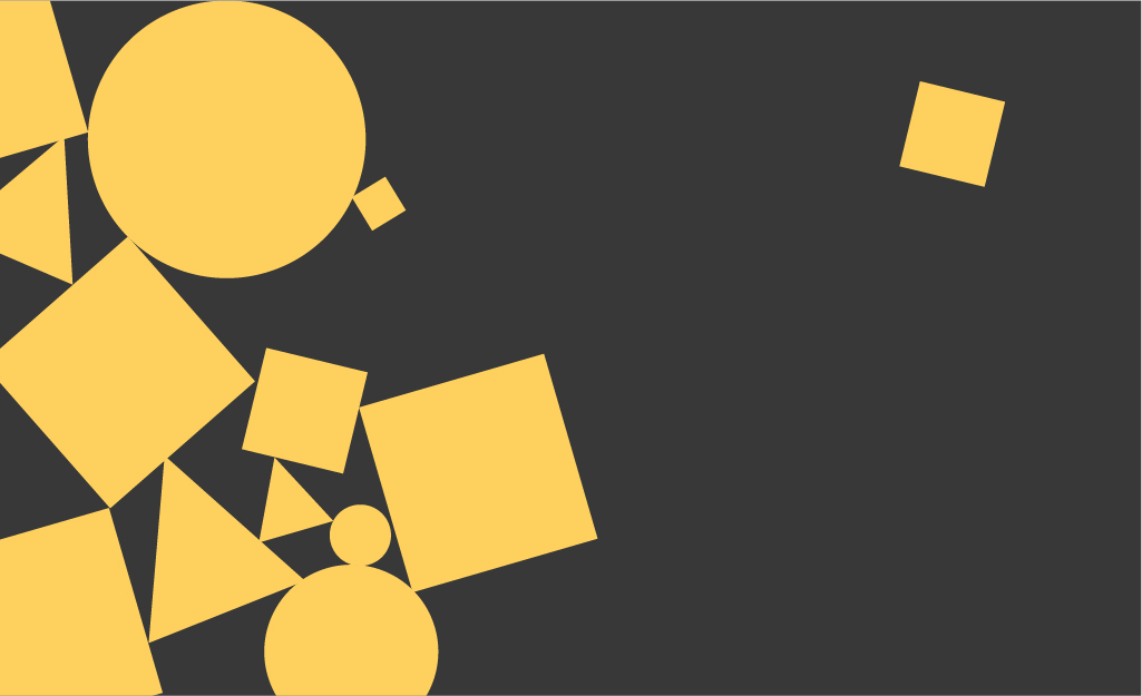
Use negative space and make the element visually more significant by putting it at a distance from the others